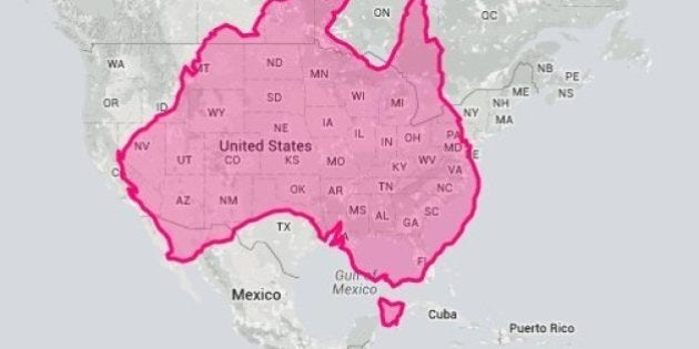
Australia is big. Really big. We all know that.
But here's a way to find out exactly how big Australia really is, compared to other nations.
Website 'The True Size' lets you grab an outline of Australia -- or any other country on the globe -- and drag it over the top of another nation (or continent), so you can compare land mass.
The site's creators say the Mercator projection, which many world maps are based off, distorts the size of certain countries and makes regular size comparisons difficult.
"Cartographers use something called a "projection" to morph the globe into 2D map. The most popular of these is the Mercator projection. Every map projection introduces distortion," the site claimed.
"One of the most common criticisms of the Mercator map is that it exaggerates the size of countries nearer the poles (US, Russia, Europe), while downplaying the size of those near the equator (the African Continent). On the Mercator projection Greenland appears to be roughly the same size as Africa. In reality, Greenland is 0.8 million sq. miles and Africa is 11.6 million sq. miles, nearly 14 and a half times larger."
Don't believe us? Check this classic scene from The West Wing, explaining things in a bit more detail (the website's creators even say this scene was the inspiration behind the tool):
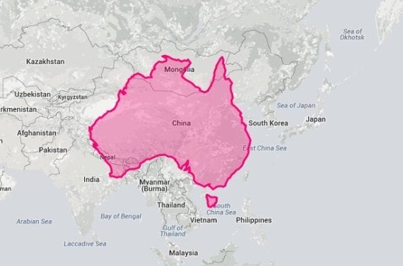
The True Size means you can properly compare countries. For instance, how about checking out Australia vs China?
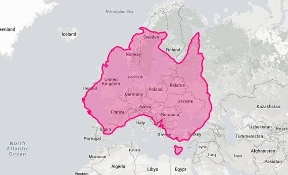
Or Australia on top of Europe?
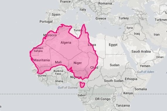
Let's compare Australia to Africa now.
We Need Your Support
Already contributed? Log in to hide these messages.
And how does the Middle East measure up?
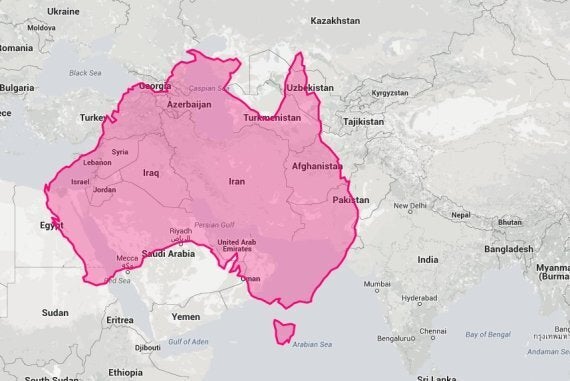
Do your own comparisons at The True Size.
